Skip to main content
Gray Balance
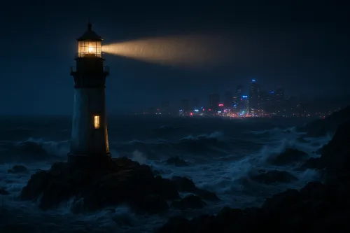
Lighthouse in a Night Storm with a City View
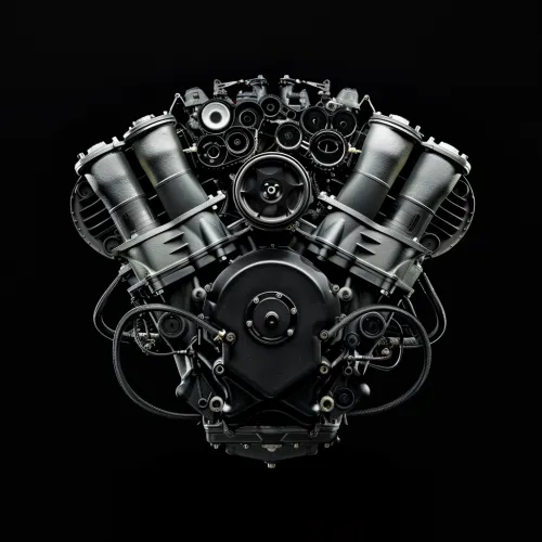
Modern Car Engine in Black Color
Abstract Black and White Canvas with Textured Surface